To see how to add and adjust charts, check out our tutorial video:
 Adding Charts and Graphs
1. In Edit mode, click or tap the blue image icon on the left, then the chart tab at the top.
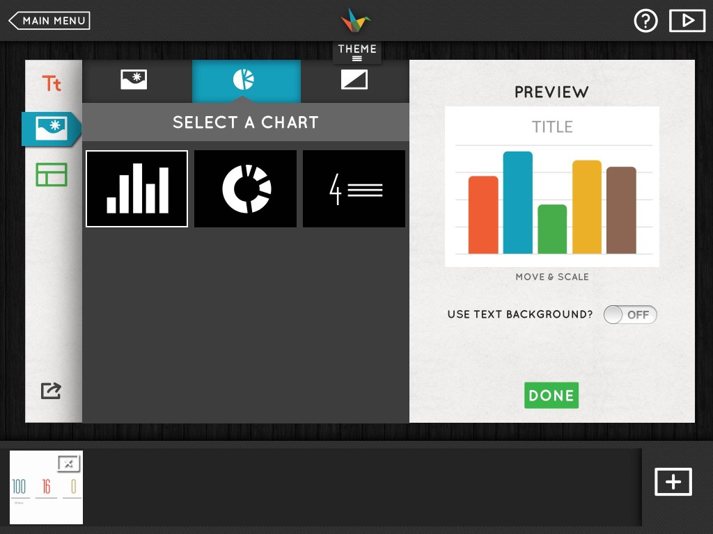
- Selecting a Chart
2. Select one of the three options for charts (bar chart, pie chart, or stat chart).
3. Use the field at the top to title your chart.
Bar Charts
- Add bars with the (+) button in the lower right corner of your graph, and drag a bar's handle all the way down to click the red (x) and delete it.
- Edit the labels below each bar to title them.
- On the iPad, tap Edit Units in the top left corner to specify the maximum and minimum values, as well as the intervals. You can do this on the web by clicking the number 100 on the left.
- Adjust the quantity for each category by pulling/clicking and dragging the circular handle up and down.
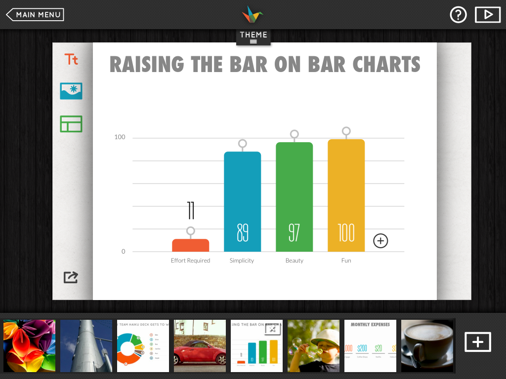
- Creating a Bar Chart
Pie Charts
- Add categories (up to a maximum of 8) by clicking/tapping the black '+' in the center of the chart.
- Edit the labels on the right to name each of your categories.
- Set the value of each category on the iPad, you can easily tap it, then adjust the circular handles with your finger. On the web, follow step 4.
- To enter the values as numbers, choose # at the top, type in your data, and then switch to %. The correct percentages will automatically be displayed. If you leave it set to # instead of %, your published deck will still show the percentage, and not the number.
- To delete a category on the iPad, minimize it using one of the grey handles until the red 'x' appears, then tap the 'x'. On the web, just click the 'x' on the right for a category.
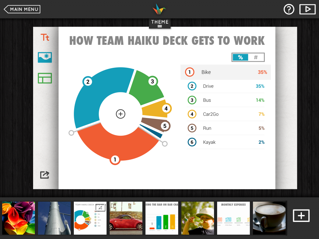
- Creating a Pie Chart
Creating Stat Charts
- Add or subtract categories (up to a maximum of 4) by using the '+' on the right edge of the chart, or the red 'x' below each category.
- For each category, type the value in the number field, and then click/tap in the captions below to edit them.
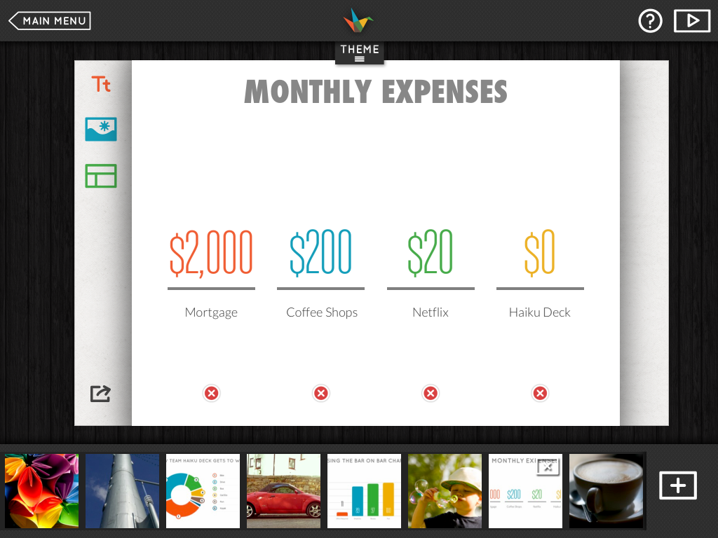
- Creating a Stat Chart
Automatic Color Palettes for Charts and Graphs
Each Haiku Deck Theme includes a coordinating color palette to give your charts and graphs a cohesive, polished look. Here is the same chart in Zissou and Cinematic theme, for example.
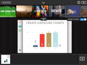
- Bar chart in Zissou theme
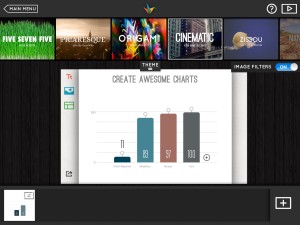
- Bar chart in Cinematic theme
Playback Mode
In Playback mode on your iPad, your charts and graphs will build with beautiful animations.
You can also tap a section of pie or a bar to highlight a specific data point as you talk.
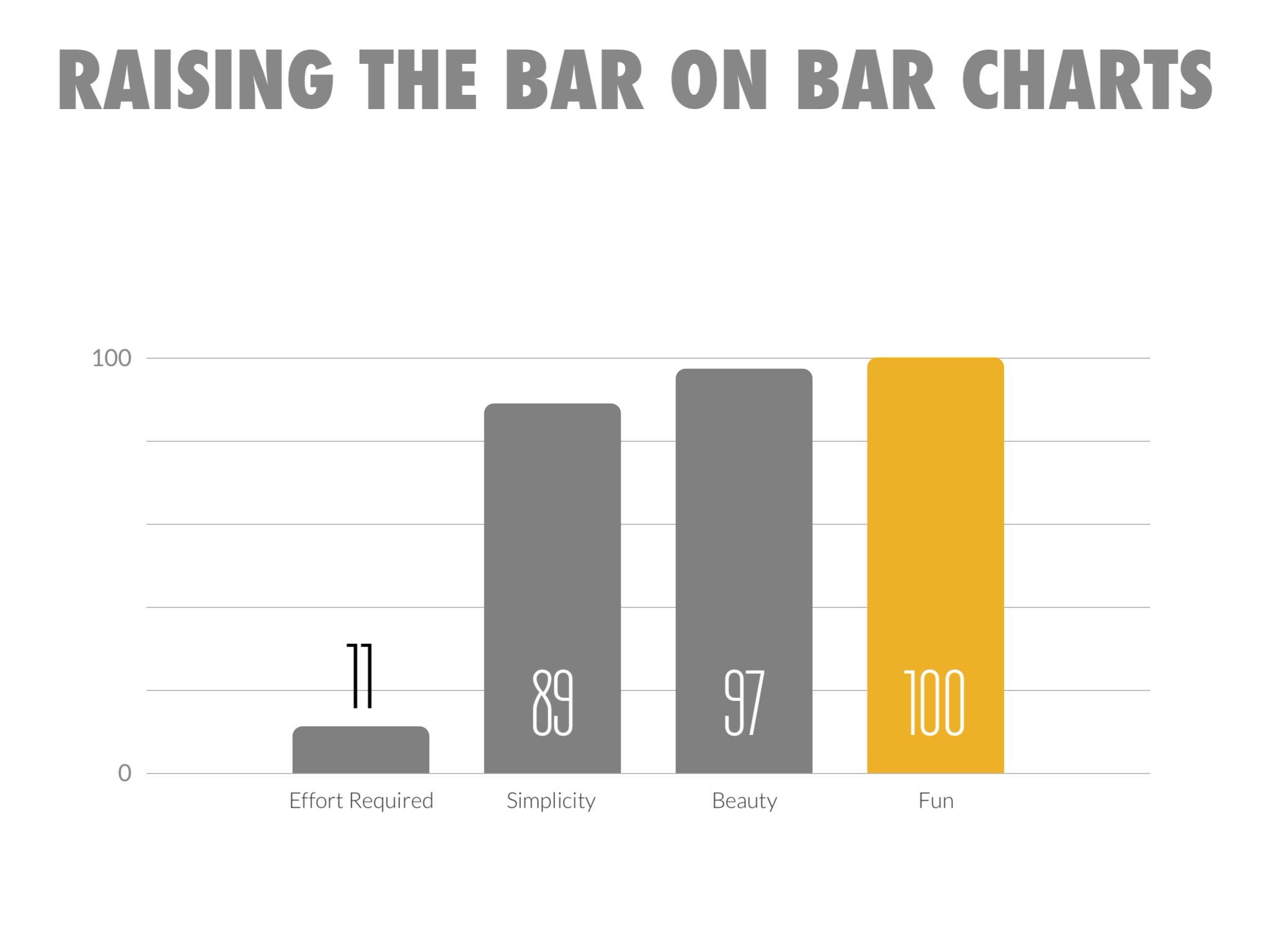
- Tap a data point as you talk to emphasize it
-
More Resources
- Ready to move onto the next section of our user guide? Click here to head to our guides on presenting your deck.
- FAQ: Adding Business Logos to Slides
 |
 |
 |
0 Comments